
Your headshot is more than a picture. It is a signal. The background color, lighting tone, and overall palette shape how people perceive you. In 2026, AI headshots give you control over those elements, which means you can design your first impression with intention.
This guide explains how color and background psychology affect perception, and how to choose the right look for your industry and goals.

Why Color and Background Matter
Humans process visual cues instantly. Color sets the mood before anyone reads your headline or bio. A background that feels modern and calm can increase trust. A background that feels loud or chaotic can reduce it.
Your goal is to use color intentionally, not randomly.
The Emotions Associated With Color
While color interpretation can vary by culture, some patterns are consistent in professional contexts.
- Blue: trust, stability, competence
- Gray: neutrality, balance, seriousness
- White: clarity, simplicity, transparency
- Black: authority, formality, power
- Green: growth, calm, balance
- Warm tones: energy, friendliness, creativity
Most professional headshots use blue, gray, or neutral tones because they signal reliability and professionalism.
Background Style Options and What They Signal
AI headshots allow you to choose different background styles. Each creates a distinct impression.
Neutral gradient:
- Clean and modern
- Keeps focus on the face
- Works for most industries
Office background:
- Signals corporate alignment
- Good for finance, consulting, enterprise roles
Cityscape blur:
- Signals ambition and energy
- Works for business development, sales, leadership
Light studio background:
- Signals simplicity and approachability
- Good for creative or client facing roles
Choose a background that matches how you want to be perceived.
Matching Backgrounds to Industry Expectations
Industry norms are real. A creative director can use a warmer background, but a finance leader should stick to neutral or cool tones.
Guidelines by industry:
- Finance and law: gray or cool blue backgrounds
- Tech and product: neutral gradients or modern office blur
- Marketing and creative: warmer tones, soft backgrounds
- Healthcare and education: clean, light backgrounds for trust
This alignment makes your photo feel natural to the viewer.
The Role of Contrast and Lighting
Contrast shapes how strong or soft your headshot feels. High contrast signals confidence and authority. Low contrast signals approachability and warmth.
Balance matters. For leadership roles, moderate contrast often works best. For client facing roles, a softer look can increase friendliness.
Use Color to Support Your Brand
Your headshot should align with your personal brand. If your brand is analytical and precise, use cool tones. If your brand is creative and energetic, use warmer tones.
A simple rule:
- Cool tones for authority
- Warm tones for approachability
- Neutral tones for flexibility
AI headshots make it easy to test each option.
The Background and Wardrobe Connection
Your wardrobe should complement the background. A dark suit works best with lighter backgrounds. A lighter outfit works better with deeper tones.
Avoid blending into the background. Your face should be the focal point.
Common Background Mistakes
Avoid these issues or your headshot will feel unprofessional:
- Busy patterns or cluttered scenes
- Bright colors that overwhelm your face
- Strong shadows that hide features
- Backgrounds that clash with your outfit
The best background is one you barely notice.
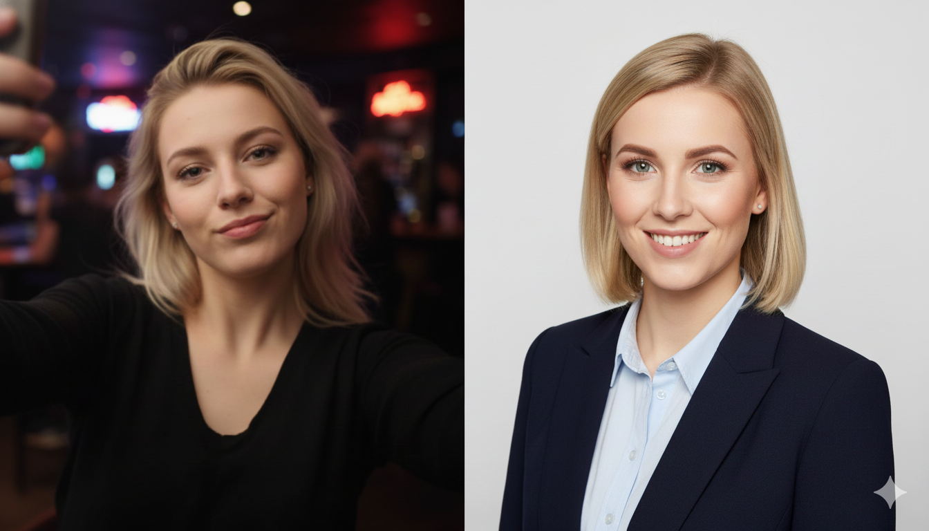
AI Headshots Make Testing Easy
One of the biggest advantages of AI is that you can test multiple backgrounds and color palettes without extra cost. Generate several variations and compare them side by side.
Ask a few trusted peers to vote on which image feels most professional. This external feedback can be more valuable than your own preference.
Practical Selection Checklist
Use this checklist to choose the best headshot:
- Does the background support your role
- Does the color palette feel professional
- Is your face the main focus
- Does the image look natural
- Does it align with your brand
If the answer is yes, you have your winner.
Use Backgrounds Across Platforms
Some platforms crop images differently. A background that looks great on LinkedIn might feel too tight on a website banner. Consider creating two versions:
- A close crop for LinkedIn
- A wider crop for website and marketing
AI tools make it easy to generate both from the same session.
Related Headshot Guides
For deeper guidance, review:
- The Psychology of a Great Headshot
- How to Choose the Right AI Headshot Style for Your Brand
- The Ultimate Guide to AI Headshots for LinkedIn in 2026
Final Thoughts: Design Your First Impression
Your headshot is a visual signal that shapes trust before you speak. In 2026, AI headshots give you full control over color and background, which means you can design your first impression with intent.
Choose a background that matches your industry, select colors that align with your brand, and keep the focus on your face. That is how you create a headshot that looks professional and feels authentic.